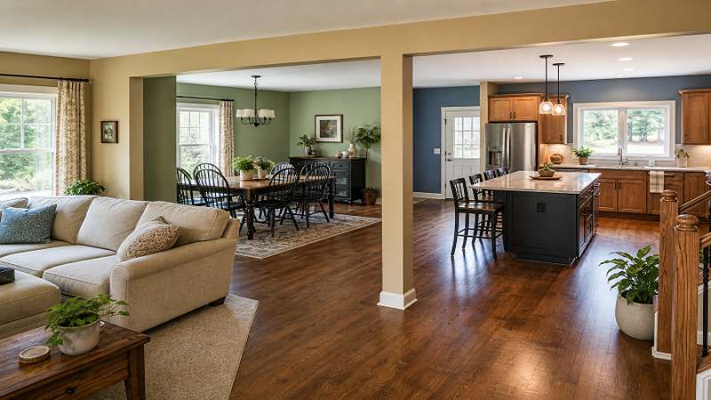
Test paint colors on large areas of the actual walls before committing.
- Natural and artificial light can make the same color look very different.
- Undertones matter just as much as the main color.
- Select paint sheen based on traffic, moisture, and cleaning needs.
- Create a whole-home flow with related colors rather than identical walls.
- Use proper ventilation and follow product directions during painting.
Choosing interior paint colors is easier when the decision starts with the room rather than a tiny paint chip or a passing trend. Whether you are refreshing one bedroom or planning Interior Painting in Kansas City, MO, the best results come from considering natural light, fixed finishes, room function, and the way nearby spaces connect. In 2026, many homeowners are leaning toward livable color palettes, including warm whites, soft greens, earthy neutrals, muted blues, and deeper accent shades. A popular color can still look wrong in a particular home, so test every option where it will actually be used.
Start With the Parts That Will Stay
Before looking at paint colors, study the features that are not likely to change. These may include wood floors, carpet, kitchen cabinets, countertops, backsplashes, brick, stone, fireplaces, built-in shelves, trim, doors, and large furniture. Each surface has an undertone that can affect the surrounding walls. For example, a cool gray may appear green beside honey-colored oak flooring. A creamy white can look noticeably yellow next to bright white countertops. Bring paint samples alongside these materials rather than evaluating them in isolation.
Read the Room’s Natural Light
North-Facing Rooms
North-facing rooms often receive cooler, softer light, which can make colors seem grayer or flatter. Warm whites, soft beige, muted taupe, and gentle earthy shades can help balance that effect without making the space feel overly yellow.
South-Facing Rooms
South-facing spaces usually receive stronger, warmer daylight. Warm paint colors may look more intense here, while soft blues, balanced grays, and muted greens can feel especially comfortable in bright rooms.
East- and West-Facing Rooms
East-facing rooms tend to change from bright and warm in the morning to cooler later in the day. West-facing rooms often do the reverse. View samples in the morning, afternoon, and evening to see the full range of shifts.
Rooms With Limited Daylight
Artificial lighting becomes especially important in rooms with few or no windows. Test samples under the bulbs normally used in the space. Lighter, more reflective colors can make a dark room feel more open, but a deeper shade can also create a purposeful, cozy atmosphere.
Choose a Color Family by Room Function
Living Rooms and Bedrooms
Living rooms often work well with warm neutrals, gentle off-whites, soft greens, and muted blues. Because they are often connected to other spaces, they can serve as a starting point for a broader palette. Bedrooms benefit from calming shades such as dusty blue, sage, warm gray, soft beige, or muted lavender. A deeper tone can feel restful when paired with lighter bedding and trim.
Kitchens, Dining Areas, and Bathrooms
Warm whites, clay-inspired tones, soft neutrals, and muted green shades can complement wood, stone, and cabinetry in kitchens and dining spaces. In bathrooms, pale blue, green, sand, gray, and white remain flexible choices, but lighting can make a subtle shade look stark. Consider cabinet color before finalizing wall color, since cabinets usually cover more visual area than a backsplash or countertop.
Home Offices, Hallways, and Entryways
Home offices can support focused colors such as blue-gray, muted green, charcoal, or warm taupe. Make sure the color works with desk lighting, screen glare, and video calls. Hallways, stairways, and entryways should connect adjoining rooms. A slightly stronger version of a nearby neutral often creates interest while preserving flow.
Build a Whole-Home Color Palette
A connected home does not need every room painted the same color. General ideas about how color can affect mood and perception can help you define the feeling you want, but your lighting and personal preferences should make the final decision.
- Choose one main color for the largest connected areas.
- Select two or three supporting colors with compatible undertones.
- Repeat trim, ceiling, or door colors to establish visual consistency.
- Use bolder shades in smaller rooms or on accent walls.
- Review the palette from major sightlines, such as the entryway or open hallway.
Understand Color, Undertone, and Finish
The main color is what you notice first, while the undertone is the subtle hue beneath it. Whites can lean pink, yellow, gray, or blue. Grays may have green, purple, or blue undertones. Beige, taupe, and greige can also lean warm or cool. Compare samples directly beside flooring, counters, cabinets, and trim to spot potential clashes. Paint finish deserves equal attention. Flat paint hides small surface flaws but is harder to clean, making it useful for ceilings and low-traffic areas. Matte has a soft, low-glare appearance that suits bedrooms and living rooms. Eggshell offers a practical middle ground for halls and common spaces. Satin is more washable for kitchens and bathrooms, while semi-gloss is a durable choice for trim, doors, cabinets, and moisture-prone areas.
Test Paint Before Making a Final Choice
- Paint large samples on more than one wall.
- Place samples near windows, flooring, trim, and major furniture.
- Check them in morning, afternoon, and evening light.
- Turn on the room’s usual lamps before deciding.
- Wait at least a full day before choosing the final color.
Small paper chips can be misleading because the color changes when they cover a larger area. A shade that looks balanced in a store may appear darker, warmer, cooler, or brighter once the room’s actual materials surround it.
Consider Indoor Air Quality During Painting
Choose products intended for interior use, read the full label, and keep children, pets, and sensitive occupants away from active work areas. When weather and safety allow, open windows and use exhaust fans that vent outdoors. The EPA notes that controlling pollution sources and increasing ventilation can help reduce indoor pollutant concentrations during remodeling projects.
Common Paint Color Mistakes to Avoid
- Choosing from a small paint chip alone.
- Ignoring undertones in flooring, countertops, or cabinets.
- Mixing unrelated warm and cool colors in connected spaces.
- Selecting sheen without considering moisture or cleaning needs.
- Painting over cracks, stains, or damaged surfaces without preparation.
- Choosing a trend color before testing it in the room.
Final Thoughts
The right interior paint color is not simply the newest or boldest option. Start with the room’s fixed features, study how natural and artificial light change throughout the day, choose a mood that fits its purpose, and compare undertones before making a decision. Test generous samples on different walls to see how the color behaves in the space. With a coordinated palette, appropriate finishes, and attention to how each room connects to the next, every space can feel distinct. At the same time, the entire home remains balanced, comfortable, and visually cohesive. See more